


Changing the Homepage Style
In this theme, there are 3 different styles for the home page as an alternative for those of you who don't like the standard style of this theme.
We're working hard to make it easy for you to style your homepage so you don't have to bother adding new CSS code. In the Edit HTML theme, search for the opening <body> tag and you will find the code as below:
Find
<!--[ Change basic layout style in desktop, try 'LS-2' or 'LS-3' ]-->
<!--<b:class name='LS-2'/>-->
Change to
<!--[ Change basic layout style in desktop, try 'LS-2' or 'LS-3' ]-->
<b:class name='LS-2'/>
Activate the above code as in the example to change it to the 2nd style or replace the attribute name='LS-2' to name='LS-3 to change the 3rd style.
Changing Mobile Navigation Style

The navigation menu in this theme also has 3 different styles, the image above is one of them. To try this section you'll need to find the opening <body> tag in your theme's HTML.
If you have found the <body> tag you will see the code as below:
Enable
<!--[ Enable tag below to change Mobile Menu style, try 'MN-2' or 'MN-3' ]-->
<b:class name='MN-2 mobS'/>
Disable
<!--[ Enable tag below to change Mobile Menu style, try 'MN-2' or 'MN-3' ]-->
<!--<b:class name='MN-2 mobS'/>-->
Change the value of MN-2 attribute to MN-3 to try other styles or disable it to revert to the theme's default style.
Collapse Navigation Menu in Desktop View
Enable
<!--[ Enable tag below to minimize Navigation Menu in desktop ]-->
<b:class name='hdMn'/>
Disable
<!--[ Enable tag below to minimize Navigation Menu in desktop ]-->
<!--<b:class name='hdMn'/>-->
In the same <body> tag section you will also find code as above, the function of that code is to collapse or minimize the navigation menu on the desktop view, the goal is to give more space to the content to make it more comfortable to read.
However, you can decide to enable/disable this feature at any time, just add a comment tag <!-- --> to disable it as in the example above.
Enable/Disable 2 Column Grid in Mobile View
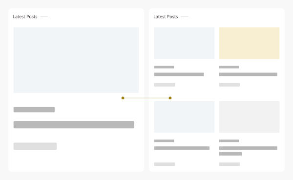
This feature serves to set a list of posts with a 2-column or 1-column style as in the image above, we realize that not everyone likes the 2-column grid view, that's why we added this function so that users can choose which one they prefer.
The code to enable/disable this function is also contained in the opening <body> tag, just below the <body> tag. You will see code like this:
Enable
<!--[ Show only one grid column in Mobile ]-->
<b:class cond='data:view.isMultipleItems' name='oneGrd'/>
Disable
<!--[ Show only one grid column in Mobile ]-->
<!--<b:class cond='data:view.isMultipleItems' name='oneGrd'/>-->
You can enable/disable above code to try this function.
Show preloader on every place

To show preloader on every place, for doing that find <body> tag and you will find the code as below:
Find
 <b:if cond='data:view.isPost or data:view.isPage'>
<!--[ Preloader (Remove it to delete preloader) ]-->
  <div class='preloader'>
<div class='dots-container'>
<div class='dot red'/>
<div class='dot yellow'/>
<div class='dot green'/>
</div>
</div>
<script>/*<![CDATA[*/ document.addEventListener('DOMContentLoaded',function(){var preloader=document.querySelector('.preloader');setTimeout(function(){preloader.classList.add('fadeOut')},2000);setTimeout(function(){preloader.classList.add('hidden')},2850)}); /*]]>*/</script>
</b:if>
Replace with
 <!--[ Preloader (Remove it to delete preloader) ]-->
<div class='preloader'>
<div class='dots-container'>
<div class='dot red'/>
<div class='dot yellow'/>
<div class='dot green'/>
</div>
</div>
<script>/*<![CDATA[*/ document.addEventListener('DOMContentLoaded',function(){var preloader=document.querySelector('.preloader');setTimeout(function(){preloader.classList.add('fadeOut')},2000);setTimeout(function(){preloader.classList.add('hidden')},2850)}); /*]]>*/</script>
Activating Product Pages in Posts
You can see an example of how it looks here. In addition to adding Product label in the post, we have also provided a post template in the product bundle which you should use for this page mode:
- Open the 'Post and Pages' folder in Google Drive,
- find the file named
Product Post.txt - copy all existing code,
- in Blogger post editor, switch to HTML mode by clicking icon and then selecting HTML View
- Paste all the code that was copied earlier into the post.
- Edit and add supporting media such as name, product image and price list before saving your post.
The label name can also be changed, you just need to find and replace some code as below:
"Product"